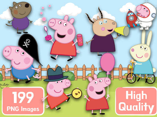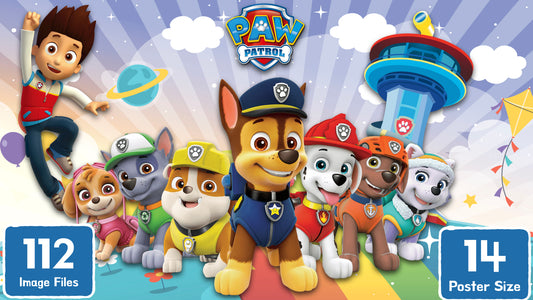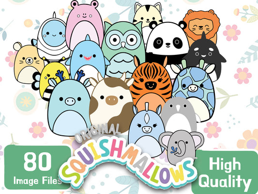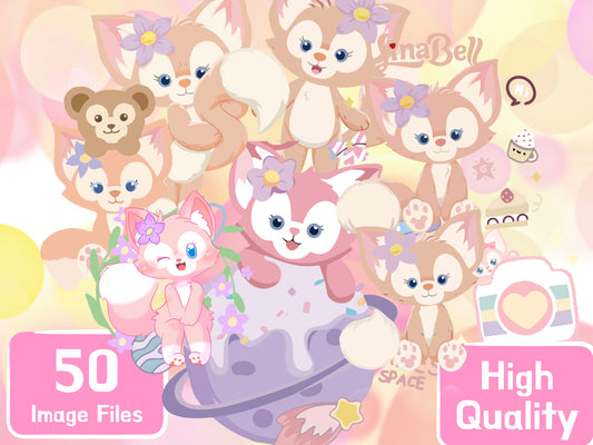
Most invitation templates give you somebody else's artwork and a box to type a name into. This one works the other way round: you bring the characters, and the tool arranges them.
It is free, it runs entirely in your browser, and there is no account to create.
Open the Birthday Invitation Maker →
Before you start: get your PNGs ready
The one thing that decides whether your card looks good is the cut-out. A transparent PNG has the background already removed, so characters can overlap each other cleanly and sit on the card as if they were posed together.
A JPEG has no transparency. Drop one in and it lands on the card as a rectangle with a visible box around it. WebP works, as long as it was saved with transparency.
Every pack in our shop is an instant download of cut-out transparent PNGs, sized and ready to drop in. If you already have artwork you own, that works just as well.
Step 1 — Add your characters
Drag your files into the drop zone, or click it to browse. You can add up to 20.
Order matters. Number 1 is the hero — it is drawn biggest, in the front row, dead centre. Everything else is arranged around it. Use the small ‹ › arrows under each thumbnail to move characters up and down the order until the one you want front and centre is sitting at number 1.
If you just want to see how it behaves before committing, hit Load sample characters and the card fills with placeholder figures.
Step 2 — Pick a style and an arrangement
Three presets set the overall feel:
- Classic — outlines, a sunburst behind the group, confetti, bunting and a big age badge. The busiest of the three.
- Sticker — heavier white outlines and a wavy panel edge, so each character reads like a cut vinyl sticker.
- Minimal — no outline, no sunburst, no confetti. Just the characters and clean type.
Then choose how the group is packed:
- Packed — a tight crowd, rows stacked from the back forward. Best for large groups.
- Triangle — widest at the front, narrowing towards the back.
- Ring — characters fan out around the age badge in the middle.
- Arch — a curve over the top of the card.
Six colour themes sit underneath: comic sky, soft pastel, royal purple, jungle, outer space and rainbow candy. Pick whichever sits closest to the party theme — the panel, the outlines and the type all recolour together.
Two buttons worth knowing
Reshuffle re-rolls the small random variations — who leans which way, who is a touch bigger — without changing your settings. Press it a few times; one of the results is usually better than the one you started with.
Auto-fit now looks at how many characters you added and how tall or wide they are, then sets the rows, the overlap and the scale so that nobody vanishes behind anybody else. The line underneath tells you what it decided, for example 11 characters, average shape 0.67 wide-to-tall → 3 rows, 2% overlap. If you have been fiddling in the advanced controls and lost the plot, this puts you back on solid ground.
Step 3 — Type the wording
There are seven fields, and they are all optional except the name:
- A handwritten top line — You're invited, or whatever you like
- Name and age
- A line under the name — is turning six!
- Date and time
- Venue
- RSVP
Leave a field blank and it disappears from the card, and everything else re-centres. The type is auto-sized: a long venue name shrinks the block rather than spilling outside the panel.
Step 4 — Check the meter, then download
Under the preview there is a readout that says Least-visible character, as a percentage. That is the worst-covered character on the card — if it says 45%, somebody is more than half hidden behind somebody else.
Anything above roughly 60% reads fine. If it is lower, drop the overlap in the advanced controls, or press Auto-fit now.
Then set the size and download.
Print settings that actually matter
- Size. 5 × 7 in is the standard invitation size and what most print shops expect. A5, A6, 4 × 6 in and a 5 × 5 in square are also there.
- 300 dpi for anything printed. 5 × 7 at 300 dpi comes out at 1500 × 2100 px. 150 dpi is fine if the card is only ever going into a group chat.
- PNG for printing, JPG for sending. PNG is lossless and larger; JPG is a fraction of the size and perfectly good on a screen.
The wording is laid out inside a safe margin, so the normal trim at a print shop will not cut into your text.
Three mistakes that ruin a card
1. Using an image with a white background
It will look fine on a white preview and then show up as an obvious white box the moment you change the colour theme. Check that your file is a PNG with real transparency before you drop it in.
2. Exporting at 150 dpi and sending it to print
On screen you cannot tell. On card stock the edges go soft and the outlines look furry. If there is any chance it gets printed, export at 300.
3. Cramming in all 20 characters
Twenty characters on a 5 × 7 card means each one is small and mostly hidden. Eight to twelve is the sweet spot. Watch the least-visible percentage and stop adding when it starts dropping.
Coming back to it later
Copy share link writes your layout, style and all your wording into the URL. Paste that link back into a browser and the card rebuilds exactly as you left it.
It does not carry your artwork — nothing you drop in is ever uploaded anywhere. The card is drawn locally in your browser, which is also why it is instant and why there is no account to make. You will need to add your PNGs again, but you will not be retyping the venue.
Ready?
Open the Birthday Invitation Maker →
Need characters first? Browse the clipart packs — every one is an instant download of transparent PNGs.
And if you are still deciding on a theme, have a look at 3 creative cartoon-themed birthday ideas your kids will love.